Statistics
Statistics require a license; the 30-day trial includes them.
The statistics table lists every population in your gate hierarchy and recomputes as gates change — move a boundary and watch the frequency settle rather than guessing where it belongs. Open it with Stats in the toolbar.
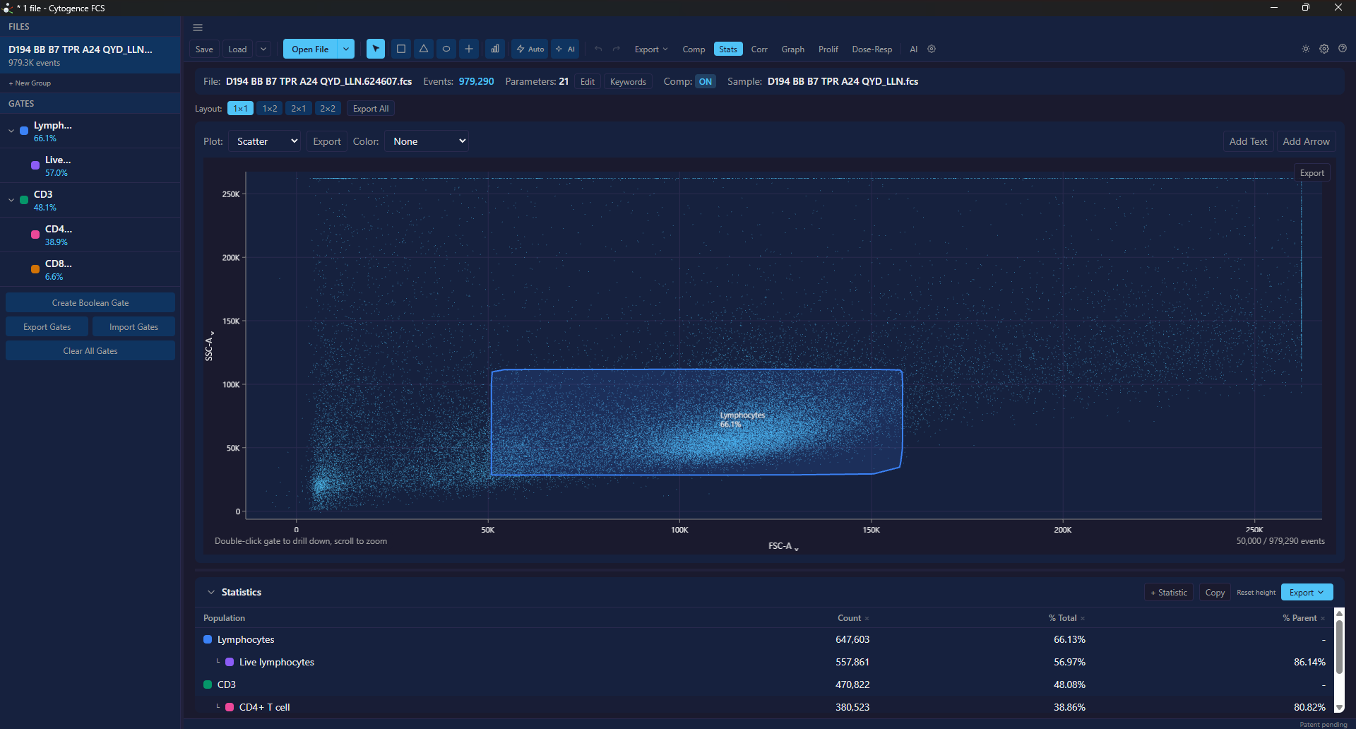
Live lymphocytes is 56.97% of all events and 86.14% of the Lymphocytes gate it sits
inside. Both are shown, so neither has to be inferred. Root populations show – for
% Parent, because they have no parent.
Percent of what?
Section titled “Percent of what?”The single most important thing on this page — and the table answers it explicitly rather than making you infer it.
Every population gets two frequency columns:
- % Total — the population as a fraction of all events in the file
- % Parent — the population as a fraction of the gate it sits inside
Read the column, not the tree. A cytometrist scanning a hierarchy naturally reads every number as a percentage of its parent, and a tree that mixes denominators is the most common way a flow figure misleads. Two labelled columns is the fix: you never have to work out which denominator a number is using.
This matters most when you are comparing a population against a published figure. “CD4⁺ is 40%” means completely different things as a fraction of all events versus as a fraction of CD3⁺ cells — and a five-fold discrepancy with the literature is usually a denominator mismatch rather than a gating error.
If a number still surprises you, check the breadcrumb above the plot to confirm which population you are inside. See drill-down.
What you get per population
Section titled “What you get per population”- Count — events inside the gate
- % Total and % Parent — see above
- Per-channel statistics, added as you need them
Click + Statistic to add columns: pick a statistic — Median, Mean, Geo Mean, CV, rCV, SD, Min or Max — and one or more parameters. Each pair becomes its own column, named by marker and statistic, so several parameters can sit side by side.
Per-channel statistics are computed on the population, so a median fluorescence intensity for CD4⁺ cells is over CD4⁺ cells only.
A statistic that does not exist for a population shows -, and exports blank: every statistic of an empty population, the SD, CV and rCV of a single event, and % Parent when the parent is empty. A 0 there would look like a measurement.
Geo Mean is computed on positive values only — a geometric mean is not defined for zero or negative values, which compensated data contains. Hover the cell to see how many values it used; it is flagged when more than 10% were left out. For fluorescence intensity on compensated data, Median is usually the better statistic to report.
Click a column header to sort. Sorting keeps the hierarchy: rows are reordered within each parent, never pulled out from under it.
A population that cannot be counted shows not counted rather than a number; hover it for the reason. That happens, for example, to a population that depends on imported labels that are not loaded, or to a combined (AND / OR / NOT) gate whose input gate was deleted — and to every population under it. Everything else in the table is still computed. (Before 0.2.2, a combined gate with a deleted input blanked the whole table.)
Comparing files
Section titled “Comparing files”With more than one file open, the table has a This file / All … files switch. All files lists every open file, so a population can be compared across samples, with a File column.
Each file is computed with its own compensation, and in the All files view the File column carries the same compensation badge as the file list — Comp, Comp* or Comp ⚠, and nothing for an uncompensated file. See Compensation.
For a statistic laid out as a files × gates grid, use Batch analysis.
Correlation heatmap
Section titled “Correlation heatmap”Corr in the toolbar opens Parameter Correlations: a matrix of how parameters covary across events, for the active file, compensated if the file is. It is computed on up to 10,000 events of the whole file, not within a gate. Useful for two things:
- Spotting compensation problems. Two channels that should be independent but correlate strongly are a spillover hint.
- Panel sanity. Markers that should co-express, do.
A channel with the same value on every event has no correlation with anything, so its row and column show -.
Exporting and copying
Section titled “Exporting and copying”Export in the statistics panel writes a CSV for the active file, or for every open file in the All files view:
- This table — one row per population, with the columns you have on screen.
- All parameters — every parameter, one row each, for marker sweeps.
Every row ends with a Compensation column saying how that file was compensated. See Exporting for the columns, the encoding, and how to read the file in Excel, Python or R.
The copy button in the statistics panel puts the table on the clipboard as tab-separated text — the selected rows, or the whole table when nothing is selected — ready to paste into a spreadsheet.
Export the compensation matrix and the gate strategy along with the numbers. A statistics table on its own does not record how it was produced.
A note on sampling
Section titled “A note on sampling”Some figures inside the app are computed on a subsample rather than on every event, for speed — the correlation heatmap above, and the events drawn on a plot. The statistics table is not subsampled — it is computed over every event in the population.